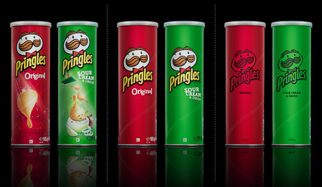
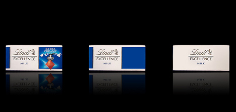
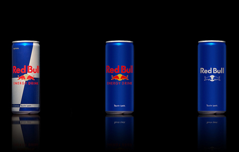
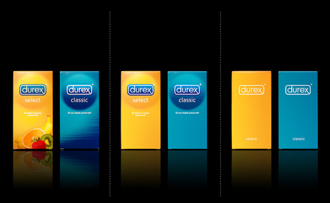
Designers Antrepo have created conceptual packaging design for well-known supermarket products by stripping back the existing graphics in stages.
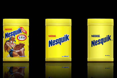
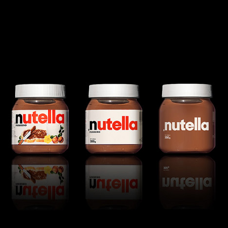
Called Minimalist Effect in the Maximalist Market, the experiment asks readers to choose which of the stages they prefer.
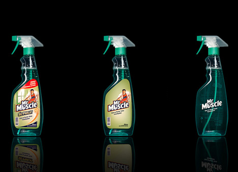
More information on the designers’ blog.
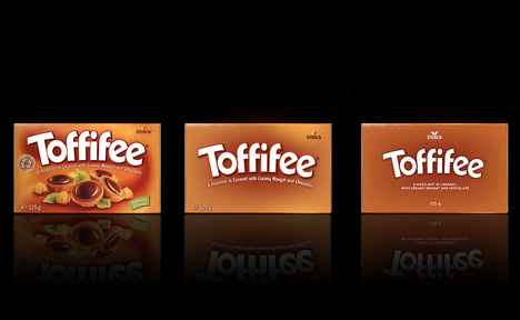
The information that follows is from Antrepo:
Minimalist Effect in the Maximalist Market
Our last project is about simplicity and we try to find alternate simple version for some package samples of the international brands. We think almost every product needs some review for minimal feeling.
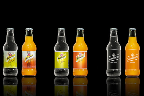
What is your choice in these 3 different variations?
1. Original variation
2. Simple variation
3. More simple variation
P.S. This project is only a design practice for showing minimal feeling of some international samples. It is an article about unnecessary items on the global brands, any of them, second or third variations are not new packaging proposals!
A dose of minimalism and efforts for changing the perception is maybe the simplest definition for Antrepo Design Product.
Antrepo is a multi-disciplinary design consultancy. Also It produces a fresh design object for better tomorrow like posters, industrial object, fonts etc.
At the base of Antrepo are New formulas created by the Antrepo Team.
